

Beautifully designed.
Feature rich. Yours.
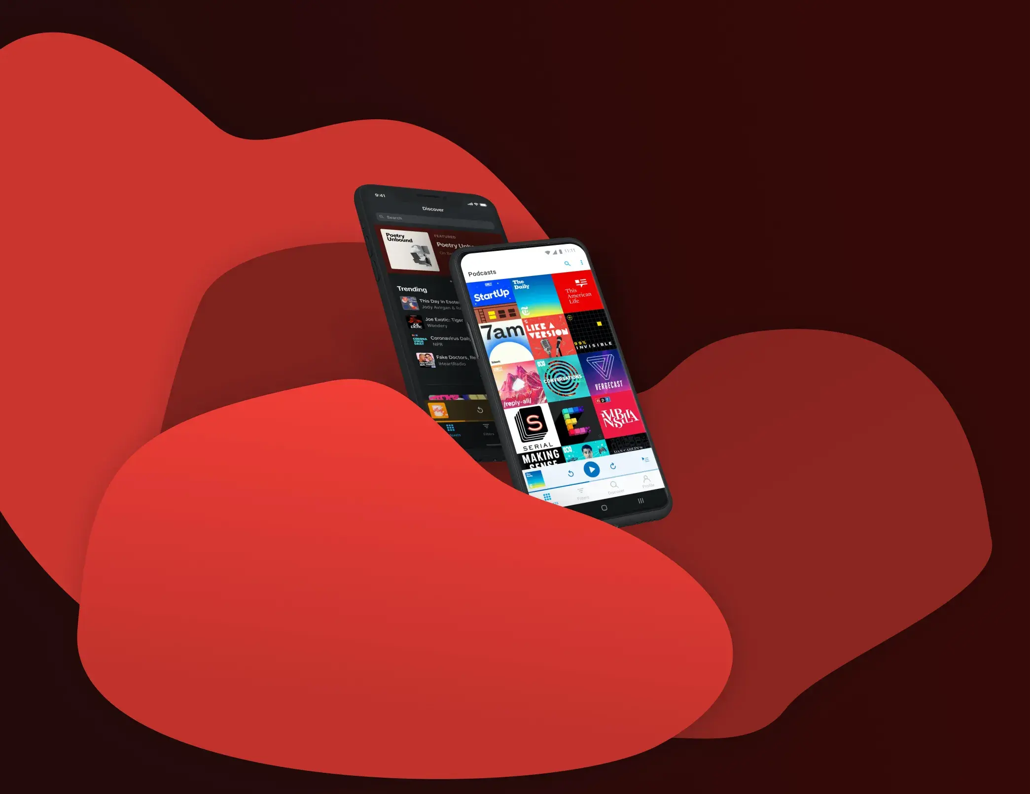
No matter how you listen to podcasts,
Pocket Casts has you covered.
Take a listen, and see for yourself.


'%3e%3c/path%3e%3cpath%20fill-rule='evenodd'%20clip-rule='evenodd'%20d='M49.9413%2039.8555C55.6513%2034.1456%2064.0206%2034.2238%2073.8761%2044.0793C83.7315%2053.9348%2083.7706%2062.3432%2078.0998%2068.014C72.429%2073.6848%2064.0597%2073.6066%2054.2042%2063.7511C44.3879%2053.9348%2044.3097%2045.4872%2049.9413%2039.8555ZM72.2335%2062.0695C74.0716%2060.2313%2073.2503%2057.611%2066.8364%2051.1971C60.4226%2044.7833%2057.6849%2043.9229%2055.8468%2045.761C54.0087%2047.5991%2054.83%2050.2194%2061.2439%2056.6333C67.6577%2063.0472%2070.3954%2063.9076%2072.2335%2062.0695ZM31.0912%2058.4026C32.1164%2057.3775%2033.7784%2057.3775%2034.8035%2058.4026L35.4989%2059.098C36.3768%2058.4769%2037.3184%2057.9624%2038.2373%2057.6064C39.1105%2057.2763%2040.1581%2057.4699%2040.8563%2058.1681C41.8261%2059.1378%2041.8061%2060.7094%2040.8551%2061.6604C40.5833%2061.9321%2040.2534%2062.1457%2039.9236%2062.2816C38.3324%2062.9806%2037.2069%2063.6407%2036.4887%2064.3588C35.3242%2065.5233%2035.4598%2066.0859%2035.7895%2066.4156C36.2938%2066.9199%2036.9924%2066.5704%2038.6031%2065.4251C41.1066%2063.6587%2044.8908%2061.1157%2047.8775%2064.1024C50.1598%2066.3847%2050.3107%2069.2491%2048.4924%2072.0915L49.4576%2073.0567C50.4827%2074.0818%2050.4827%2075.7439%2049.4576%2076.769C48.4324%2077.7941%2046.7704%2077.7941%2045.7453%2076.769L44.8505%2075.8743C43.6364%2076.7612%2042.4266%2077.3576%2041.1596%2077.7248C40.2865%2077.9773%2039.3553%2077.7836%2038.6765%2077.1048C37.7067%2076.1351%2037.7073%2074.5442%2038.6777%2073.5737C39.0077%2073.2438%2039.3958%2073.0108%2039.8033%2072.9137C41.2197%2072.5445%2042.5393%2071.8456%2043.6844%2070.7005C44.4219%2069.963%2044.8685%2069.0121%2044.3642%2068.5079C43.86%2068.0036%2043.0644%2068.2949%2041.5507%2069.3432L41.3553%2069.4787C38.8362%2071.2269%2035.1804%2073.764%2032.0241%2070.6077C30.225%2068.8086%2029.789%2065.8846%2031.7854%2062.8092L31.0912%2062.115C30.0661%2061.0898%2030.0661%2059.4278%2031.0912%2058.4026Z'%20fill='url(%23paint1_linear)'%3e%3c/path%3e%3ccircle%20opacity='0.2'%20cx='87'%20cy='33'%20r='6'%20fill='url(%23paint2_linear)'%3e%3c/circle%3e%3cdefs%3e%3clinearGradient%20id='paint0_linear'%20x1='12.8301'%20y1='22.1778'%20x2='94.2215'%20y2='110.244'%20gradientUnits='userSpaceOnUse'%3e%3cstop%20stop-color='%2303A9F4'%3e%3c/stop%3e%3cstop%20offset='1'%20stop-color='%2350D0F1'%3e%3c/stop%3e%3c/linearGradient%3e%3clinearGradient%20id='paint1_linear'%20x1='32.9247'%20y1='39.5511'%20x2='66.268'%20y2='84.072'%20gradientUnits='userSpaceOnUse'%3e%3cstop%20stop-color='%2303A9F4'%3e%3c/stop%3e%3cstop%20offset='1'%20stop-color='%2350D0F1'%3e%3c/stop%3e%3c/linearGradient%3e%3clinearGradient%20id='paint2_linear'%20x1='81.6052'%20y1='28.0141'%20x2='91.5461'%20y2='38.7702'%20gradientUnits='userSpaceOnUse'%3e%3cstop%20stop-color='%2303A9F4'%3e%3c/stop%3e%3cstop%20offset='1'%20stop-color='%2350D0F1'%3e%3c/stop%3e%3c/linearGradient%3e%3c/defs%3e%3c/svg%3e)
The best. Now free.
The world’s most powerful podcast platform, now available for free.

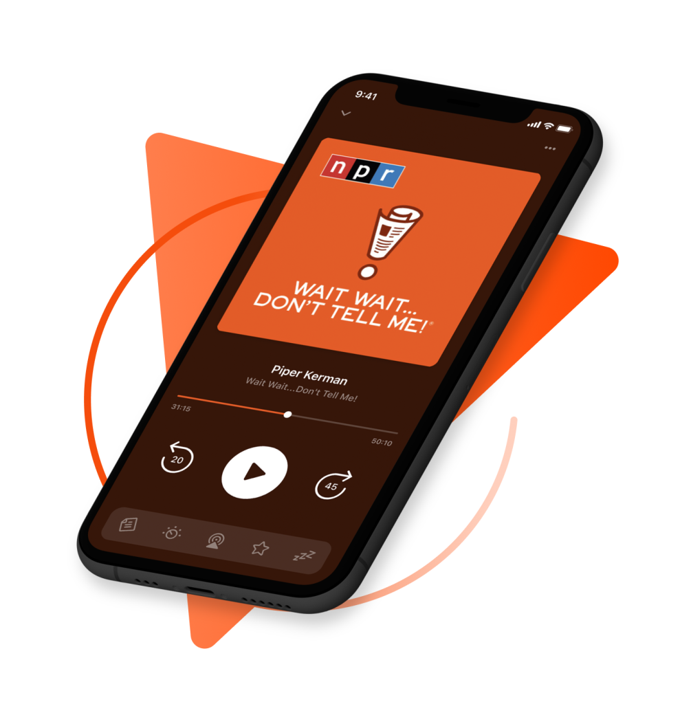
Easy to use
Our podcast player provides next-level listening, search and discovery tools.
'%20fill='url(%23paint0_linear)'%3e%3c/rect%3e%3crect%20opacity='0.2'%20x='41.5267'%20y='58.45'%20width='25.2348'%20height='7.49999'%20rx='3.74999'%20transform='rotate(-15%2041.5267%2058.45)'%20fill='url(%23paint1_linear)'%3e%3c/rect%3e%3crect%20opacity='0.2'%20x='45.0207'%20y='71.49'%20width='31.2213'%20height='7.5'%20rx='3.75'%20transform='rotate(-15%2045.0207%2071.49)'%20fill='url(%23paint2_linear)'%3e%3c/rect%3e%3cpath%20fill-rule='evenodd'%20clip-rule='evenodd'%20d='M58.9876%2014.9484C59.0201%2015.0698%2059.0499%2015.1912%2059.0772%2015.3126L61.9824%2014.5342C63.9744%2014.0004%2066.0009%2014.5346%2067.4542%2015.7856L71.3551%2014.7404C76.9824%2013.2326%2082.7475%2015.9857%2085.225%2021.0221L79.6909%2028.4632L78.8076%2025.1668C78.1644%2022.7662%2075.6969%2021.3416%2073.2963%2021.9848L70.3985%2022.7613C71.2561%2025.9621%2069.3566%2029.2521%2066.1558%2030.1097L42.6114%2036.4184C39.4106%2037.2761%2036.1206%2035.3766%2035.2629%2032.1758L32.7274%2032.8552C30.3268%2033.4985%2028.9022%2035.966%2029.5454%2038.3666L44.2981%2093.4243C44.9413%2095.8249%2047.4088%2097.2496%2049.8094%2096.6063L90.3783%2085.7359C92.7789%2085.0927%2094.2035%2082.6252%2093.5603%2080.2246L88.807%2062.4852L94.6475%2055.3043L100.805%2078.2834C102.52%2084.685%2098.721%2091.2651%2092.3194%2092.9804L51.7506%20103.851C45.349%20105.566%2038.7689%20101.767%2037.0536%2095.3655L22.301%2040.3077C20.5857%2033.9061%2024.3846%2027.3261%2030.7862%2025.6108L34.3249%2024.6626C34.958%2022.8525%2036.446%2021.3766%2038.438%2020.8429L41.7054%2019.9674C41.6682%2019.8486%2041.6334%2019.7285%2041.6009%2019.6072C40.3144%2014.806%2043.1637%209.87093%2047.9649%208.58446C52.7661%207.29798%2057.7011%2010.1472%2058.9876%2014.9484ZM53.9165%2016.3072C54.4525%2018.3077%2053.2653%2020.364%2051.2648%2020.9C49.2643%2021.4361%2047.2081%2020.2489%2046.6721%2018.2484C46.136%2016.2479%2047.3232%2014.1916%2049.3237%2013.6556C51.3242%2013.1196%2053.3805%2014.3067%2053.9165%2016.3072Z'%20fill='url(%23paint3_linear)'%3e%3c/path%3e%3cpath%20fill-rule='evenodd'%20clip-rule='evenodd'%20d='M93.6804%2017.8272L91.89%2020.2344L90.0997%2022.6416L71.1869%2048.0714L72.2866%2055.215L73.1996%2061.1451L79.1297%2060.232L86.1209%2059.1556L105.036%2033.7503L106.828%2031.344L108.618%2028.9368L113.519%2022.3465C114.53%2020.9876%20114.248%2019.0667%20112.889%2018.0561L102.872%2010.6064C101.513%209.59573%2099.5924%209.87804%2098.5818%2011.2369L93.6804%2017.8272ZM100.222%2030.1697L82.777%2053.5997L78.2168%2054.3019L77.4988%2049.6386L94.9142%2026.2223L100.222%2030.1697ZM98.4948%2021.4078L103.804%2025.3561L106.954%2021.1198L101.645%2017.1715L98.4948%2021.4078Z'%20fill='url(%23paint4_linear)'%3e%3c/path%3e%3cdefs%3e%3clinearGradient%20id='paint0_linear'%20x1='39.6362'%20y1='46.0437'%20x2='42.2302'%20y2='57.943'%20gradientUnits='userSpaceOnUse'%3e%3cstop%20stop-color='%2303A9F4'%3e%3c/stop%3e%3cstop%20offset='1'%20stop-color='%2350D0F1'%3e%3c/stop%3e%3c/linearGradient%3e%3clinearGradient%20id='paint1_linear'%20x1='42.7994'%20y1='59.0837'%20x2='45.983'%20y2='70.674'%20gradientUnits='userSpaceOnUse'%3e%3cstop%20stop-color='%2303A9F4'%3e%3c/stop%3e%3cstop%20offset='1'%20stop-color='%2350D0F1'%3e%3c/stop%3e%3c/linearGradient%3e%3clinearGradient%20id='paint2_linear'%20x1='46.5953'%20y1='72.1238'%20x2='49.2326'%20y2='84.0031'%20gradientUnits='userSpaceOnUse'%3e%3cstop%20stop-color='%2303A9F4'%3e%3c/stop%3e%3cstop%20offset='1'%20stop-color='%2350D0F1'%3e%3c/stop%3e%3c/linearGradient%3e%3clinearGradient%20id='paint3_linear'%20x1='21.3386'%20y1='23.8553'%20x2='108.295'%20y2='59.9091'%20gradientUnits='userSpaceOnUse'%3e%3cstop%20stop-color='%2303A9F4'%3e%3c/stop%3e%3cstop%20offset='1'%20stop-color='%2350D0F1'%3e%3c/stop%3e%3c/linearGradient%3e%3clinearGradient%20id='paint4_linear'%20x1='111.658'%20y1='23.2763'%20x2='81.4942'%20y2='13.7269'%20gradientUnits='userSpaceOnUse'%3e%3cstop%20stop-color='%2303A9F4'%3e%3c/stop%3e%3cstop%20offset='1'%20stop-color='%2350D0F1'%3e%3c/stop%3e%3c/linearGradient%3e%3c/defs%3e%3c/svg%3e)
Curated by experts
Find your next obsession with our hand curated podcast recommendations.
Why Pocket Casts?
When you’re ready to dive into the world of podcasting, it’s best to take a guide to show you the way. Pocket Casts will introduce you to content you’ll fall in love with, and help you manage it all with ease. Find out why people listen for longer and enjoy content more with Pocket Casts.
'%3e%3c/path%3e%3cpath%20opacity='0.5'%20fill-rule='evenodd'%20clip-rule='evenodd'%20d='M32.5%2030C32.5%2027.9289%2034.1789%2026.25%2036.25%2026.25H53.75C55.8211%2026.25%2057.5%2027.9289%2057.5%2030C57.5%2032.0711%2055.8211%2033.75%2053.75%2033.75H36.25C34.1789%2033.75%2032.5%2032.0711%2032.5%2030ZM32.5%2041.25C32.5%2039.8693%2033.6193%2038.75%2035%2038.75H55C56.3807%2038.75%2057.5%2039.8693%2057.5%2041.25C57.5%2042.6307%2056.3807%2043.75%2055%2043.75H35C33.6193%2043.75%2032.5%2042.6307%2032.5%2041.25ZM35%2048.75C33.6193%2048.75%2032.5%2049.8693%2032.5%2051.25C32.5%2052.6307%2033.6193%2053.75%2035%2053.75H55C56.3807%2053.75%2057.5%2052.6307%2057.5%2051.25C57.5%2049.8693%2056.3807%2048.75%2055%2048.75H35Z'%20fill='url(%23paint1_linear)'%3e%3c/path%3e%3cdefs%3e%3clinearGradient%20id='paint0_linear'%20x1='15.2738'%20y1='20.2641'%20x2='53.7636'%20y2='68.486'%20gradientUnits='userSpaceOnUse'%3e%3cstop%20stop-color='%2303A9F4'%3e%3c/stop%3e%3cstop%20offset='1'%20stop-color='%2350D0F1'%3e%3c/stop%3e%3c/linearGradient%3e%3clinearGradient%20id='paint1_linear'%20x1='33.7608'%20y1='28.5739'%20x2='56.6098'%20y2='51.0492'%20gradientUnits='userSpaceOnUse'%3e%3cstop%20stop-color='%2303A9F4'%3e%3c/stop%3e%3cstop%20offset='1'%20stop-color='%2350D0F1'%3e%3c/stop%3e%3c/linearGradient%3e%3c/defs%3e%3c/svg%3e)
Read all about it
It keeps getting better.
“Although Android finally has its own podcasts app, you may want to check out a very good third-party option: Pocket Casts, which as of this year is owned by NPR and three other public radio producers. And it’s only gotten better since, with a big redesign arriving just last month that delivers some much-requested features.”

The complete package
“The interface is beautiful and clean and intuitive, and the discover page has featured shows, curated lists, and top charts to help you find new podcasts… It really is the complete package.”


'%3e%3cpath%20d='M5.36943%2034.4679H0V0.345789L5.36943%200.692039V34.4679Z'%20fill='%23B8C3C9'%3e%3c/path%3e%3cpath%20d='M14.1588%2034.4679H8.78936V10.1321L14.1588%2010.4352V34.4679ZM11.4741%202.72729C13.1629%202.72729%2014.5485%204.11299%2014.5485%205.80175C14.5485%207.49075%2013.1629%208.87645%2011.4741%208.87645C9.78529%208.87645%208.39966%207.49075%208.39966%205.80175C8.39966%204.11299%209.78529%202.72729%2011.4741%202.72729Z'%20fill='%23B8C3C9'%3e%3c/path%3e%3cpath%20d='M26.9769%2015.0251V20.3945H22.9498V34.4444H17.5803V7.75036C17.5803%203.6801%2020.9578%20-0.000712058%2024.9417%20-0.000712058C26.2839%20-0.000712058%2027.3666%200.389201%2027.6265%200.562209L27.4098%205.71511H24.9417C23.859%205.71511%2022.9498%206.62452%2022.9498%207.75036V15.0251H26.9769Z'%20fill='%23B8C3C9'%3e%3c/path%3e%3cpath%20d='M34.518%2019.7017H38.5451V17.1903C38.5451%2016.0643%2037.6357%2015.155%2036.553%2015.155C35.4272%2015.155%2034.518%2016.0643%2034.518%2017.1903V19.7017ZM29.1484%2017.1903C29.1484%2013.1197%2032.4393%209.78559%2036.553%209.78559C40.6235%209.78559%2043.9144%2013.1197%2043.9144%2017.1903V22.3867C43.9144%2023.9021%2042.702%2025.0711%2041.2299%2025.0711H34.518V27.4096C34.518%2028.5352%2035.4272%2029.4448%2036.553%2029.4448H41.7062L41.8794%2033.9916L37.0296%2034.7276C32.3527%2035.5071%2029.1484%2031.4798%2029.1484%2027.4096V17.1903Z'%20fill='%23B8C3C9'%3e%3c/path%3e%3cpath%20d='M48.5061%2034.4679V0.562229H51.9705V10.868C52.9231%2010.565%2054.4386%2010.4352%2055.4778%2010.4352C59.1586%2010.4352%2062.0164%2013.7694%2062.0164%2017.5368V34.4679H58.6389V17.5368C58.6389%2015.6747%2057.1234%2014.2024%2055.2614%2014.2024H51.9705V34.4679H48.5061Z'%20fill='%23B8C3C9'%3e%3c/path%3e%3cpath%20d='M74.6894%2027.9292V22.0833H71.3551C69.4933%2022.0833%2068.021%2023.5557%2068.021%2025.4174V27.9292C68.021%2029.7909%2069.4933%2031.3065%2071.3551%2031.3065C73.2174%2031.3065%2074.6894%2029.7909%2074.6894%2027.9292ZM74.6894%2016.9736C74.6894%2015.025%2073.78%2013.466%2071.3119%2013.7261H71.3551C69.9694%2013.7693%2068.1943%2013.9425%2066.7219%2014.0291C66.6787%2012.7733%2066.6353%2012.297%2066.5921%2011.3444C67.7612%2010.9113%2069.4499%2010.4782%2070.879%2010.435C75.2092%2010.3484%2078.0672%2013.8559%2078.0672%2017.623V27.9292C78.0672%2031.6529%2075.0794%2034.7275%2071.3551%2034.7275C67.6313%2034.7275%2064.5569%2031.6529%2064.5569%2027.9292V25.8073C64.5569%2022.0833%2067.1116%2019.2687%2071.3551%2019.2687C72.9575%2019.2687%2073.78%2019.442%2074.6894%2019.7015V16.9736Z'%20fill='%23B8C3C9'%3e%3c/path%3e%3cpath%20d='M87.7697%2010.4351C91.4939%2010.4351%2094.5682%2013.4661%2094.5682%2017.2335V17.6666C93.2259%2017.7099%2092.1432%2017.7099%2091.1475%2017.7531V17.2335C91.1475%2015.4149%2089.6317%2013.8994%2087.7697%2013.8994C85.9511%2013.8994%2084.4785%2015.4149%2084.4785%2017.2335V28.0591C84.4785%2029.9643%2085.9511%2031.3934%2087.7697%2031.3934C89.5885%2031.3934%2091.104%2030.0077%2091.1475%2028.1889C92.836%2028.319%2094.4384%2028.4055%2094.5682%2028.4055C94.3949%2031.9995%2091.3639%2034.8576%2087.7697%2034.8576C84.0459%2034.8576%2081.0144%2031.8263%2081.0144%2028.0591V17.2335C81.0144%2013.4661%2084.0459%2010.4351%2087.7697%2010.4351Z'%20fill='%23B8C3C9'%3e%3c/path%3e%3cpath%20d='M108.217%2034.4679L101.635%2022.9926C100.985%2021.867%20100.985%2021.737%20101.765%2020.3946L107.567%2010.7816H111.508L104.969%2021.867L112.027%2034.4679H108.217ZM100.769%200.648846V34.4679H97.3044V0.648846H100.769Z'%20fill='%23B8C3C9'%3e%3c/path%3e%3cpath%20d='M116.22%2020.9142H122.888V17.2768C122.888%2015.4149%20121.372%2013.8994%20119.554%2013.8994C117.692%2013.8994%20116.22%2015.4149%20116.22%2017.2768V20.9142ZM112.755%2017.2768C112.755%2013.5096%20115.787%2010.4352%20119.554%2010.4352C123.278%2010.4352%20126.309%2013.5096%20126.309%2017.2768V22.6031C126.309%2023.5992%20125.53%2024.3352%20124.577%2024.3352H116.22V28.0157C116.22%2029.8777%20117.692%2031.3935%20119.554%2031.3935H123.927C123.971%2032.5191%20124.014%2033.299%20124.101%2034.078L119.944%2034.7276C115.7%2035.4638%20112.755%2031.7832%20112.755%2028.0157V17.2768Z'%20fill='%23B8C3C9'%3e%3c/path%3e%3cpath%20d='M132.812%2034.4679H129.348V17.58C129.348%2013.8126%20132.293%2010.3053%20136.623%2010.3917C138.095%2010.4352%20139.004%2010.7816%20140%2011.2579C139.957%2012.2971%20139.914%2013.1632%20139.871%2013.9426L136.103%2013.8561C134.284%2013.8561%20132.812%2015.8047%20132.812%2017.58V34.4679Z'%20fill='%23B8C3C9'%3e%3c/path%3e%3c/g%3e%3cdefs%3e%3cclipPath%20id='clip0'%3e%3crect%20width='140'%20height='34.8574'%20fill='white'%3e%3c/rect%3e%3c/clipPath%3e%3c/defs%3e%3c/svg%3e)


'%3e%3cpath%20d='M23.0526%2012.4327L46%200L45.9838%2025.0167L25.6391%2036.0931L2.73297%2023.5096L2.8027%2023.4514L23.0526%2012.4327Z'%20fill='%23B8C3C9'%3e%3c/path%3e%3cpath%20opacity='0.5'%20d='M2.73295%2023.5101L43.3177%2045.769L43.3243%2026.5452L43.3357%2026.4817L45.9838%2025.0167L45.9976%2050L23.0611%2037.5188L22.9696%2037.495L0.0393185%2024.9944L0.0293579%200.176453L22.869%2012.2863L23.0977%2012.408L20.5321%2013.8017L2.70022%204.36384L2.71066%2023.3884L2.73295%2023.5101Z'%20fill='%23B8C3C9'%3e%3c/path%3e%3cpath%20d='M0.0394178%2024.9944L22.9697%2037.495L0.02756%2050.0005L0.0266113%2025.0351L0.0394178%2024.9944Z'%20fill='%23B8C3C9'%3e%3c/path%3e%3cpath%20d='M0.0294583%200.45813C0.0285097%200.476551%200.0275611%200.494487%200.0261381%200.512908C0.0223436%200.49982%200.0166518%200.487216%200.0157032%200.474127C0.0152289%200.469279%200.0247152%200.463462%200.0294583%200.45813Z'%20fill='%23B8C3C9'%3e%3c/path%3e%3cpath%20d='M0.0265616%2025.0352C0.0279846%2025.0516%200.0298818%2025.0681%200.0313048%2025.0846C0.0208699%2025.0865%200.0104349%2025.0885%200%2025.0904C0.00901198%2025.072%200.018024%2025.0536%200.0265616%2025.0352Z'%20fill='%23B8C3C9'%3e%3c/path%3e%3cpath%20d='M0%2025.0909C0.0104349%2025.0889%200.0208699%2025.087%200.0313048%2025.0851C0.0298818%2025.103%200.0289332%2025.1209%200.0275103%2025.1394C0.0184983%2025.1229%200.00901198%2025.1069%200%2025.0909Z'%20fill='%23B8C3C9'%3e%3c/path%3e%3cpath%20d='M2.71069%2023.3884C2.74152%2023.4093%202.77188%2023.4301%202.80271%2023.4514C2.77947%2023.4708%202.75623%2023.4902%202.73299%2023.5101C2.72587%2023.4694%202.71828%2023.4291%202.71069%2023.3884Z'%20fill='%23B8C3C9'%3e%3c/path%3e%3cpath%20d='M43.3244%2026.5452C43.3149%2026.5296%2043.3059%2026.5136%2043.2964%2026.4981C43.3082%2026.4889%2043.3215%2026.4836%2043.3358%2026.4817C43.332%2026.503%2043.3282%2026.5238%2043.3244%2026.5452Z'%20fill='%23B8C3C9'%3e%3c/path%3e%3c/g%3e%3cpath%20d='M71.9023%2012.8281L78.875%2031.3555L85.8311%2012.8281H91.2598V37H87.0762V29.0312L87.4912%2018.373L80.3525%2037H77.3477L70.2256%2018.3896L70.6406%2029.0312V37H66.457V12.8281H71.9023ZM103.18%2026.5576L100.44%2029.4629V37H96.2402V12.8281H100.44V24.167L102.765%2021.2949L109.837%2012.8281H114.917L105.936%2023.5361L115.432%2037H110.451L103.18%2026.5576ZM117.689%2037V12.8281H125.974C128.707%2012.8281%20130.788%2013.376%20132.216%2014.4717C133.644%2015.5674%20134.357%2017.1999%20134.357%2019.3691C134.357%2020.4759%20134.059%2021.472%20133.461%2022.3574C132.863%2023.2428%20131.989%2023.929%20130.838%2024.416C132.144%2024.7702%20133.151%2025.4398%20133.859%2026.4248C134.579%2027.3988%20134.938%2028.5719%20134.938%2029.9443C134.938%2032.2132%20134.208%2033.9564%20132.747%2035.1738C131.297%2036.3913%20129.216%2037%20126.505%2037H117.689ZM121.89%2026.0928V33.6465H126.555C127.872%2033.6465%20128.901%2033.32%20129.643%2032.667C130.384%2032.014%20130.755%2031.1064%20130.755%2029.9443C130.755%2027.432%20129.471%2026.1481%20126.903%2026.0928H121.89ZM121.89%2023.0049H126.007C127.313%2023.0049%20128.331%2022.7116%20129.062%2022.125C129.803%2021.5273%20130.174%2020.6862%20130.174%2019.6016C130.174%2018.4062%20129.831%2017.543%20129.145%2017.0117C128.469%2016.4805%20127.412%2016.2148%20125.974%2016.2148H121.89V23.0049ZM158.33%2037H154.146V26.2588H143.339V37H139.139V12.8281H143.339V22.8887H154.146V12.8281H158.33V37ZM163.311%2037V12.8281H170.449C172.585%2012.8281%20174.478%2013.304%20176.127%2014.2559C177.787%2015.2077%20179.071%2016.5579%20179.979%2018.3066C180.886%2020.0553%20181.34%2022.0586%20181.34%2024.3164V25.5283C181.34%2027.8193%20180.881%2029.8337%20179.962%2031.5713C179.054%2033.3089%20177.754%2034.6481%20176.061%2035.5889C174.378%2036.5296%20172.447%2037%20170.267%2037H163.311ZM167.511%2016.2148V33.6465H170.25C172.452%2033.6465%20174.14%2032.9603%20175.313%2031.5879C176.498%2030.2044%20177.101%2028.2233%20177.123%2025.6445V24.2998C177.123%2021.6768%20176.553%2019.6735%20175.413%2018.29C174.273%2016.9066%20172.618%2016.2148%20170.449%2016.2148H167.511Z'%20fill='%23B8C3C9'%3e%3c/path%3e%3cdefs%3e%3cclipPath%20id='clip0'%3e%3crect%20width='46'%20height='50'%20fill='white'%3e%3c/rect%3e%3c/clipPath%3e%3c/defs%3e%3c/svg%3e)
“It’s smart listening, made simple”
Apple, App of the Day
(June 14, 2019)