Chicago Humanities Tapes
·S4 E8
How Classic Painted Signs Help Us Time Travel with Heavy Pages Press
Episode Transcript
1
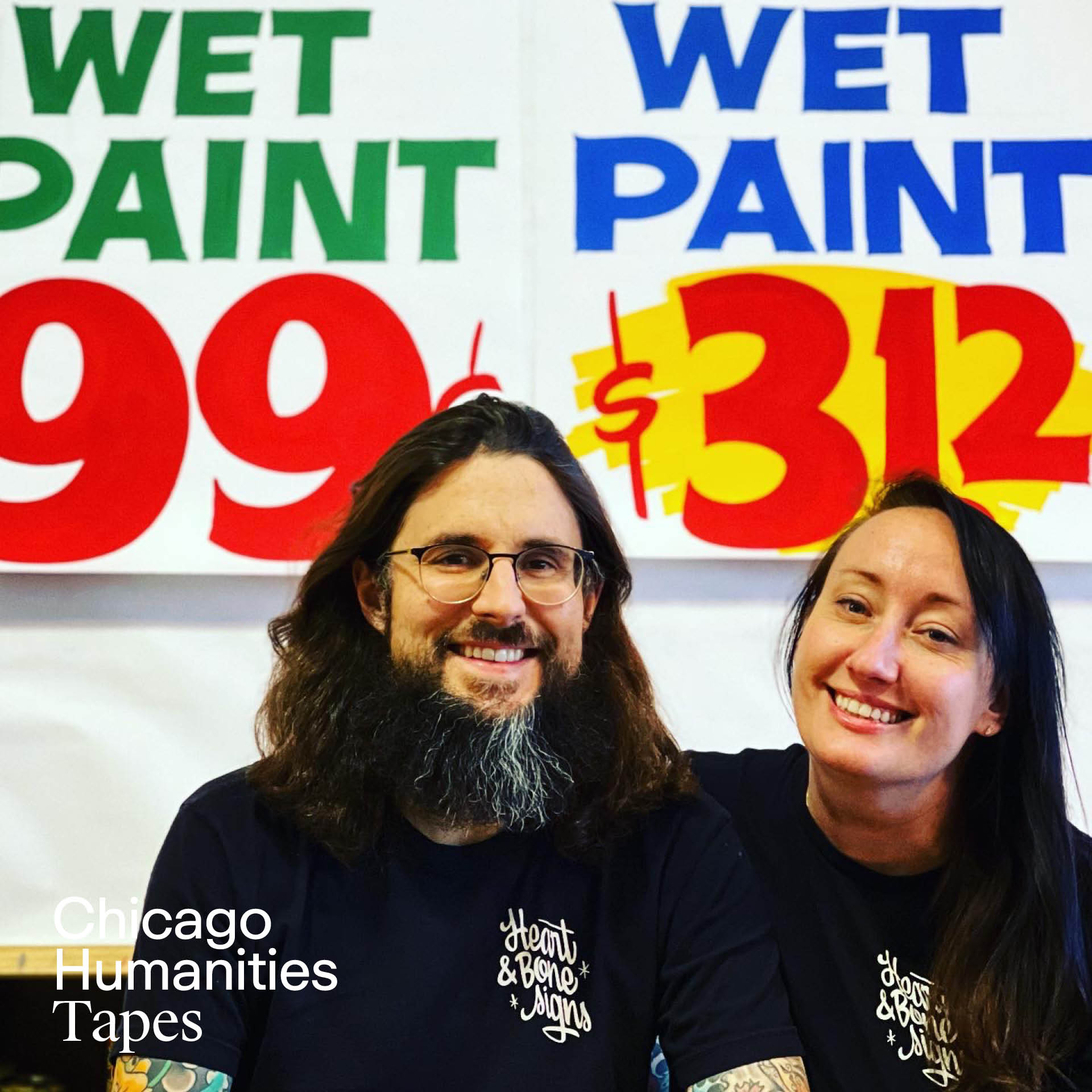
00:00:00,000 --> 00:00:01,000
ANDREW MCLELLAN: I think there's something that's very classic Americana about it that I think people may not realize why they're attracted to it, but there's just something enticing about it.
2
00:00:01,000 --> 00:00:02,000
[Theme music plays]
3
00:00:02,000 --> 00:00:03,000
[Cassette tape player clicks open]
4
00:00:03,000 --> 00:00:04,000
ALISA ROSENTHAL: Hey all what’s going on, thanks for tuning into Chicago Humanities Tapes - the audio arm of the live Chicago Humanities Spring and Fall Festivals. I’m your host Alisa Rosenthal, here to help us uncover the answers to humanity's biggest questions with help from great thinkers and riveting conversations.
5
00:00:04,000 --> 00:00:05,000
Today, Andrew and Kelsey McClellan, the duo behind sign painting business Heart and Bone Signs. A chance encounter in Chicago with a perfectly preserved “ghost sign” by the Beverly Sign Co. from the 1930s led them to uncover previously lost sign design sketches. They started their publishing company Heavy Pages Press to help share these incredible resources for sign designers and collectors alike. You’ve undoubtedly seen their work all over the city – their nostalgic and evocative gold leaf lettering graces the storefronts of tattoo parlors, barbershops, delis, and so much more.
6
00:00:05,000 --> 00:00:06,000
They joined me in studio to chat about their new book The Golden Era of Sign Design: The Rediscovered Sketches of Beverly Sign Co., what it was like to interview tough talking old timer painters, and their hope for how access to this rediscovered material will usher in the next generation of great designers.
7
00:00:06,000 --> 00:00:07,000
Our conversation only scratches the surface on their great wealth of knowledge on vintage sign design, so to hear more, check out their upcoming Chicago Humanities event on Saturday, May 10th at Co-Prosperity in Bridgeport. Head to chicagohumanities.org for tickets and to see what other great events we’ve got going on as part of our Bridgeport neighborhood day so you can make a nice day of it!
8
00:00:07,000 --> 00:00:08,000
[Theme music plays]
9
00:00:08,000 --> 00:00:09,000
ALISA ROSENTHAL: Kelsey and Andrew, hello.
10
00:00:09,000 --> 00:00:10,000
KELSEY MCCLELLAN: Hi.
11
00:00:10,000 --> 00:00:11,000
ALISA ROSENTHAL: Thank you so much for joining me. Where are you coming to me from?
12
00:00:11,000 --> 00:00:12,000
KELSEY MCCLELLAN: We are in Arcadia Terrace neighborhood of Chicago, Illinois.
13
00:00:12,000 --> 00:00:13,000
ALISA ROSENTHAL: Ah, nice. And I see some nice signs behind you.
14
00:00:13,000 --> 00:00:14,000
KELSEY MCCLELLAN: Yes.
15
00:00:14,000 --> 00:00:15,000
ALISA ROSENTHAL: I thought I'd start with a visual description for this podcast.
16
00:00:15,000 --> 00:00:16,000
KELSEY MCCLELLAN: Everywhere we go, there's signs.
17
00:00:16,000 --> 00:00:17,000
ALISA ROSENTHAL: Yeah. So I'm really interested in diving into your book. It's so beautiful. And I'm interested in hearing a little bit about your background with signed sign design and how that brought you to restoration and preservation.
18
00:00:17,000 --> 00:00:18,000
KELSEY MCCLELLAN: Yeah, we, our background is in painting, like fine art painting. And we sort of ignorantly were painting signs. We just to kind of pay the bills basically. And, we noticed all the signs downtown and I had seen a few gold leaf signs. One had a signature. And I was just always really curious how he did that, what they were about. So I reached out to the name on one of the signatures and he was open to having us talk to him. His name's Robert Frese and he had been gilding in Chicago for the past 40 years. And it was like perfect timing. He was getting close to retirement. He was ready to share some of his knowledge and we were excited to learn and so we've kind of developed a mentorship relationship and we've for the past now, 12 years have been painting signs in the city and have been part of this kind of resurgence of sign painting because it in the nineties really took a downturn as new technologies came out like vinyl and it basically obliterated a whole group of trades people. So through our work and our eagerness to learn about the trade, we've met all of these wonderful sign painters of an older generation and they've been very gracious and taught us lot about their experience and you know, they want the craft to live on. So it's really important to them that we care about it and we maintain it and then we pass it on. So essentially what happened, the preservation kind of happened out of, I guess luck, coincidence and just obsession over signs. Basically a building was slated for demolition in the Ravenswood neighborhood, and in the middle of the night, the team took down all the vinyl siding because it had asbestos in it and they didn't want to go through the right channels to have it removed during the daytime. But what it revealed were these amazing 100-year-old ghost signs that had been preserved for 70, 80 years, and they were perfect. And we ran over there, we heard about it. And something in our minds just said, you need to save these. And so we kind of just figured it out and, uh, fortunately we knew the developer from our past project and they said, You can take it down as long as you do it in the next 20 days. And so we've learned how to become preservationists.
19
00:00:18,000 --> 00:00:19,000
ALISA ROSENTHAL: You're coming from fine art, you're learning sign painting, you are learning what the laws around preservation in the state of Illinois are.
20
00:00:19,000 --> 00:00:20,000
KELSEY MCCLELLAN: A crash course, and essentially what happened with that was one of the signs, there were two, and one was painted by, it had a signature of Briggs on it. And what we learned was that it was painted a gentleman named Jack Briggs, who started a company called Beverly Sign Co., and they were world-renowned for their sign design. And they're kind of this like underground sign, well-known sign company that every sign painter and sign designer up to our generation admires and knows everything about. But most people have never heard of them. So it just so happened that the founder painted this building, this sign in the 1930s, and one of our friends who's a sign painter contacted us. He's in his 70s and he said, oh, I have a collection of 200 to 300 original sketches from Beverly Sign Co. and my mentor has always wanted to make a book. It's his dream. No one would agree to make book or support him. Do you think we can make this happen? And again, maybe it's just our own characteristics, we said, we have to, and we learned how to publish a book. So add on to that list, we self-published this book called The Golden Era of Sign Design: The Rediscovered Sketches of Beverly Sign Co.
21
00:00:20,000 --> 00:00:21,000
ALISA ROSENTHAL: That's so incredible. That's really that's that's the art students coming out. Like I will learn what's in front of me. Something I really loved about this book is the characters that it's almost like, like a like a mystery piecing together all of the characters and the clues all around sign design. And I'm really interested in what, what was the reception like from these old timer sign painters, when you came by and had all these questions for them and had an interest in this, what, what I'm sure feels like very like niche job that they have done in the past.
22
00:00:21,000 --> 00:00:22,000
ANDREW MCLELLAN: Yeah, they were really very willing to share their experiences with us. I think they were a bit surprised that we were actually going to make this happen. Thankfully, we've been in the industry for over a decade now, so I think a lot of them have heard of us, know the work that we do, know that we're very serious, and so they were willing to take us seriously that we we're going to actually see this through. And, you know, the reactions were kind of all over the board, always positive, but one of the most interesting things we found is that as we were interviewing so many of these people, inevitably the conversation would end up wandering towards stock car racing and hand painting stock cars, which is something that we are not of that world, of the generation that was doing that kind of thing. And as it turns out, the letter styling of stock car painting here in Chicago is pretty much the main precursor to the style of NASCAR cars today.
23
00:00:22,000 --> 00:00:23,000
ALISA ROSENTHAL: That's so cool.
24
00:00:23,000 --> 00:00:24,000
ANDREW MCCLELLAN: Like Beverly Sign Co. was so influential with sign design the stock car culture in Chicago is very influential as far as the way that race cars look up to today. And so as we were speaking to these gentlemen, they would, you know, we'd be talking to them trying to ask about the ins and outs of working every day in the sign shop. And they would always talk about once they clocked out and once they got home and they were painting these race cars and oftentimes racing them themselves, which is also pretty amazing.
25
00:00:24,000 --> 00:00:25,000
ALISA ROSENTHAL: This is the most Chicago way this could go. Like a hot dog out the window.
26
00:00:25,000 --> 00:00:26,000
KELSEY MCCLELLAN: We all live in Beverly too, so.
27
00:00:26,000 --> 00:00:27,000
ALISA ROSENTHAL: Oh, yeah! I, I don't know very much about sign design, but I do know the phrase ghost sign. Can you speak to a little what that is?
28
00:00:27,000 --> 00:00:28,000
KELSEY MCCLELLAN: It's basically a sign that has effectively disappeared, but you can still see the outlines or you can make out what the advertisement would have said. So it's a sign, that generally is on brick, that has faded with time, as inevitably all signs do and they, the term ghost sign just comes from, I guess it's sort of like, I think it's kind of a nod to the past and it's like this thing that is of a different time that's kind of a ghost of old advertising that we still can see kind of, sort of. There's a lot of them around Chicago.
29
00:00:28,000 --> 00:00:29,000
ALISA ROSENTHAL: I always find it really magical when I see one, like it feels like you're traveling back in time.
30
00:00:29,000 --> 00:00:30,000
KELSEY MCCLELLAN: Yes!
31
00:00:30,000 --> 00:00:31,000
ALISA ROSENTHAL: I wonder what the experience was like specifically with the Ravenswood signs.
32
00:00:31,000 --> 00:00:32,000
ANDREW MCLELLAN: The best way to describe what that was like was surreal. Because as Kelsey was describing, oftentimes when you see a ghost sign, sometimes you can barely make it out at all. Sometimes you can only see it after it's rained and the bricks saturate and you can kind of see some of the paint come through and normally you can't see it at all, sometimes they're not that old maybe they're from the 90s and you can still make them out plenty well. I think with these ones, one of the main reasons why they were so intense to look at, especially the Ward's Breads sign, was the reds on the sign were so bright. And red color, red paint, is the most fugitive color for any type of art, and sign painting would be no different. So old red paint just like isn't a thing. It always fades. It can fade pink, it can fade brown, it can almost disappear entirely. But it certainly doesn't stay bright red. And the reds on this sign were so intense and so bright. And it really gave that striking feeling like you were time traveling you like this thing could have been painted a year ago, but it was painted in 1936.
33
00:00:32,000 --> 00:00:33,000
ALISA ROSENTHAL: Wow. And you've got the big full-color picture of you in front of the wall in the book. That's so special. So then that's what started you on this journey of like, we've got to document this. And I think the book is just such a good resource for not just aficionados of design, but also design students.
34
00:00:33,000 --> 00:00:34,000
KELSEY MCCLELLAN: Absolutely. Yeah, it's been amazing to see the different types of people that have purchased the book and why they're interested in it. I mean, lots of designers, a lot of the sign community, and then burgeoning designers who are interested in sign painting, but maybe they don't think that it's a viable career or, , you know, don't know how to start and, but they still want to include some of the sign design elements in their design practice, which I think is like perfect example of someone who I hope finds the book. And then a lot of, interestingly, a lot corporate designers, like corporate companies have bought it for their design team, which I think is really exciting. Hopefully, I always joke that, like, I hope AI or these bigger people can kind of absorb some of these things so we can get better design because they were, the designers were like geniuses. It's kind of like this crazy microcosm of just very skilled and very creative and and forward thinking designers during, like for mid-century design.
35
00:00:34,000 --> 00:00:35,000
ANDREW MCLELLAN: We got to do a cool collaboration with Field Notes recently.
36
00:00:35,000 --> 00:00:36,000
ALISA ROSENTHAL: Oh, oh I'm familiar.
37
00:00:36,000 --> 00:00:37,000
ANDREW MCLELLAN: That's awesome.
38
00:00:37,000 --> 00:00:38,000
ALISA ROSENTHAL: They're so beautiful.
39
00:00:38,000 --> 00:00:39,000
ANDREW MCLELLAN: Well, thanks so much. That has kind of opened the door to a whole other section of people who wouldn't have found it, perhaps, otherwise, and lots of reception in that arena as well. I think there's something that's very classic Americana about it that I think people may not realize why they're attracted to it, but there's just something enticing about it. One of the really enjoyable things we've had the experience of after releasing this book is people who have grown up in Chicago, maybe people who are in their like 70s, will remember specific businesses. And we've gotten these cool stories like, oh, I bought my first car there, or I had my first date there, I got my first loan there.
40
00:00:39,000 --> 00:00:40,000
KELSEY MCCLELLAN: Yeah.
41
00:00:40,000 --> 00:00:41,000
ANDREW MCLELLAN: Just all of these very personal. experiences that people have shared with us, which has been really cool.
42
00:00:41,000 --> 00:00:42,000
ALISA ROSENTHAL: That's so special. And I was really interested too in, as I was going through the book, it's such a loving portrait of the people that make up Chicago, specifically in mid-century. And I think it really, it's very focused on Beverly, but it starts to spread out into different neighborhoods. And I'm curious if you could speak to the diversity you started to discover as you got deeper into sign design.
43
00:00:42,000 --> 00:00:43,000
KELSEY MCCLELLAN: Well, they were based on the South Side, uh, it was 73rd and Halsted is where their, the shop was, which is now, I believe it's a Walgreens. And so a lot of our research was in the Englewood neighborhood and South Side area, trying to find old signs, find any of these businesses, hoping that they existed and really nothing, it was very difficult. But we did find, we had all the sketches out on our table at our shop and I was kind of trying to do like a quick search of these places and then a portrait popped up and it was John Stallworth who runs John's Hardware and Bicycle. And it was such a striking portrait. And it was like really the only portrait or a face like that in all the sketches, it was kind of unique. And so I looked it up, sure enough, he's still in business. And we were able to get in contact with him through some other people and met him. So he's an African-American small business owner that's ran his business, the South Side, Halsted for the past 70 years. And his story is like amazing. And, so it was so cool to like talk to him and just, he was able to really give us a perspective of what it was like to be a business owner during that time and what it would have been like to, you know, be in such a in place and kind of help contextualize what, where all industry went, why did, why had so many businesses close? I mean, a lot of it was, he's in the hardware industry or business. And so a lot it was that like big box stores, like Home Depot came in and just obliterated all the small businesses, a lot of white flight. And you know, all of these issues and obviously disinvestment from the city and redlining all these issues kind of really impacted the area. And so it was really like, I think, eyeopening for us to, you know, have his story on top of all the sign painters stories who kind of like, were able to go in, paint and have those experiences, but then leave and they weren't really like at the businesses, they weren't you know, their experiences like ours as sign painters is sort of like kind of a touch and go basis. We we're obviously like it's a big part of the advertisement and the marketing of a business, but the day to day operations are a whole nother thing. And so it definitely gave us a ton of appreciation for legacy businesses in Chicago who have like stuck around and their families are a part of it and the community is a part of it. So that is so cool. That was a really cool part and we loved seeing a lot of the designs for the South Side like a lot of beauty products. Those were some of my favorite drawings and some of the things that we had picked up. Because Chicago is such a segregated city, especially back then, what we learned is that they would send the sign painters who lived on the North Side to the South Side, and the South Side painters to the North Side. So they would encourage them to work quickly, and then they wouldn't hang out at the bars after they finished on the clock, and they'd go back home. So it's an interesting part of kind of the geography of Chicago and the diversity and how people kind of engage in the landscape, especially even back then.
44
00:00:43,000 --> 00:00:44,000
ALISA ROSENTHAL: Yeah, yeah. This is so interesting. In the book you talk a lot about how trends in design change. Obviously there were huge changes through the mid-century, changes we're going through now. And I'm interesting if you could speak a little to those and then what you see about trends, where things are trending for the future.
45
00:00:44,000 --> 00:00:45,000
ANDREW MCLELLAN: Well, I think, you know, before 1980s, design in signs was very, very important for several different reasons. One, you have to kind of take yourself back to that time to appreciate this, but signs and that type of advertising was like the advertising that these businesses had. This is, you know, before color television, certainly before the internet and so people would really invest in signage and invest in printed advertising and that those types of graphics and the people who were at these larger firms who had these big clients were really invested in creating the best eye catching designs out there. And now as Kelsey had mentioned earlier the advent of the vinyl plotter, all of a sudden anyone could make signs, and you didn't have to have any of this design background. I think out of fear of being left out, all of these different sign companies all just went towards this vinyl plotter. And people who didn't care about signs, they only cared about money, didn't care about advertising, started getting into it. And one of the first things to go was quality design. And these legacy designers, you know, maybe they were near retirement anyway, or maybe they just got cut from the payroll but that had a very severe effect on signage in the United States. And there's a lot of other reasons too, but that's a pretty huge one.
46
00:00:45,000 --> 00:00:46,000
KELSEY MCCLELLAN: Yeah, I, and I think too with sign design, traditionally all of these sign designers would go to trade school and they'd spend like two to four years learning the basics of letters which is kind of an iteration of type design there, which also has a really long history in Chicago. So like these people studied type and could replicate any alphabet. And then not only that, use that alphabet in a specific layout to sell a product and catch your eye as you're driving down the street within seven seconds. Like they were just a different breed of designer and it was super fast paced. You know, in the drawings, you can see like they're crossing out things, they're writing over on like, nothing is sacred. It's not like a pristine drawing. A lot of them have what's called a strikethrough, which is basically like a slice of color. And they would do that simply to quickly tell the customer what the colors are going to be, but they didn't have time to colorize the entire sketch. Everything during that time was like, fast, but quality. And I think now, you know, vinyl has definitely changed signage, where like, I mean, I think the most frustrating thing is, and most probably designers would agree, is that just like, you, know, no, no kerning, no you know like -
47
00:00:46,000 --> 00:00:47,000
ANDREW MCLELLAN: Margins.
48
00:00:47,000 --> 00:00:48,000
KELSEY MCCLELLAN: Yeah, no margins, meaning like things are just crammed on a window, like, there's no thought about the experience of the viewer, it's more about a transaction. And one of the things that our collaborator Bob talked about is that a lot of this design that they were producing is emotional. And that's what they like would talk about. They would talk about the ideas of emotion. They use color and shapes to have you respond emotionally to the advertisement. And I think now so much of advertising is digital. And it's on screens so we're really having to compete with that and you know, for a long time, people were like, well, why do I even need a sign? I can just have a website or, but it's, you know and oftentimes we'll have to say to people like, you don't need like your full www.yourname.com on your door. It's not only is it visually unpleasant, but it's unnecessary. I mean, it's like, and there's a different way to organize information so that people, it's pleasing to the eye and that it's engaging. It's inviting you into the store. And a lot of what we do is storefront design rather than like large scale brick signs and things like that. So I I would say right now I think that there is a lot of people who are interested in vintage style sign design, and they just don't know how to find all the resources for this because a lot of it wasn't saved, it was just thrown away. The only reason why these exist is because, as it says in the book, there was a young journeyman sign painter who, the foreman, the union foreman said, hey, get rid of all these sketches. And he said, just like throw them away. And he collected them all. And he was like, is it okay if I just keep them? And he's like, whatever you do, just get them out of here. And so that is literally the only reason they exist. So a lot of what we hope to do is share more of these, these archival materials that we find, share more of these stories of people who are passionate about design and lettering and share it with a broader audience. So that's kind of why we've continued to do with our publishing company Heavy Pages Press.
49
00:00:48,000 --> 00:00:49,000
ALISA ROSENTHAL: And where can people see your work out and about in Chicago?
50
00:00:49,000 --> 00:00:50,000
ANDREW MCLELLAN: All over the place, north, south, east, west, we've got signs everywhere.
51
00:00:50,000 --> 00:00:51,000
KELSEY MCCLELLAN: I, we are pretty proud of the Monadnock building downtown. We always tell people to go down there. It's not only is it like an amazing, important architectural building, but it maintains the gold standard. So all of the signs are gold leaf, and they're amazing. It's usually it's mostly us and our mentor at this point, but even if you go upstairs, all the doors are hand lettered.
52
00:00:51,000 --> 00:00:52,000
ALISA ROSENTHAL: I saw on your Instagram you did the lettering for Foursided.
53
00:00:52,000 --> 00:00:53,000
KELSEY MCCLELLAN: Yes! Yeah they asked us to do one and then they like totally loved it. And then they're amazing. And they have like five locations?
54
00:00:53,000 --> 00:00:54,000
ANDREW MCLELLAN: Five stores yeah. A good place to check out a nice handful of them would be Clark Street. Yeah, we have so, I mean Little Chompers we did, Esquire Barbershop, Early to Bed, Foursided, Via Rose, Rare Form.
55
00:00:54,000 --> 00:00:55,000
KELSEY MCCLELLAN: Andersonville has been really great, they've been good to us.
56
00:00:55,000 --> 00:00:56,000
ALISA ROSENTHAL: Wow. This is like my walk to coffee is all of these shops. That's great. Well, my last question for you is, why, right now, with all the things we can be interested in and all the directions we can go, why is sign design so important?
57
00:00:56,000 --> 00:00:57,000
KELSEY MCCLELLAN: I think we probably have different answers, but my answer is because I think small businesses are like the backbone of cities and they're really important. And I think good sign design in cities especially allows people to engage with new businesses. And it's, we're in a time period where people like to it be, they call it Instagramable. You know, you want people to have, you want your storefront to be memorable. First impressions are important. And so a big part of our mission is to support the growth of small businesses. So we feel that sign, good sign design allows for that. Do you have a different answer?
58
00:00:57,000 --> 00:00:58,000
ANDREW MCLELLAN: Couldn't have said it better. Great.
59
00:00:58,000 --> 00:00:59,000
ALISA ROSENTHAL: Well, Kelsey, Andrew, thank you so much for your time. I look forward to seeing your event and thanks so much.
60
00:00:59,000 --> 00:01:00,000
KELSEY MCCLELLAN: Yeah thank you!
61
00:01:00,000 --> 00:01:01,000
[Theme music plays]
62
00:01:01,000 --> 00:01:02,000
ALISA ROSENTHAL:: For more information on Heavy Pages Press, plus links to buy their book and Field Notes collaboration, head to the show notes or chicagohumanities.org.
63
00:01:02,000 --> 00:01:03,000
Chicago Humanities Tapes is produced and hosted by me, ALISA ROSENTHAL:, with help from the staff at Chicago Humanities who are programming and producing our speakers and live events. If you’re liking this podcast programming, the best way you can support us is by clicking subscribe so you can be notified whenever we publish a new episode, leaving us a rating and review, and sharing your favorite episode with someone you think would enjoy it. We appreciate you listening! We’ll be back in two weeks with another new episode for you. But in the meantime, stay human.
64
00:01:03,000 --> 00:01:04,000
[Theme music plays]
65
00:01:04,000 --> 00:01:05,000
[Cassette tape player clicks closed]